Right well I must first say how pleased I am that we've all managed to wrap up our project and get it handed in without too much horrible horrible stress. I think our group got off quite lightly compared to other teams with the same project. We managed to produce a fairly decent final film clip of our environment we all designed.
I will briefly go over some points I'd like to make about how I feel about the project.
What did I enjoy doing?
Fortunately, the members of my group had a range of different strengths. We had a modeler, a compositor, an animator and an all rounder. They needed someone who was able contribute more of a 2D aspect to the film, and I feel that is my true strength. So I was able to do stuff that I loved, like doing concept work, animatics in Toonboom, and some animation in 3D. Toonboom is a fantastic new tool that I have had fun getting used to.
I also enjoyed working with some people I don't often talk to that much. I feel that we all worked well together, and this helped us think positively about our work.
What did I dislike doing?
I can't really think of anything that I really hated about this project. I guess I was a little apprehensive about animating in Maya, but once I had gotten the hang of how to do it properly, I found that it was a lot of fun.
What did I struggle with?
Like I said above, I struggled with Maya at first, but that was because I needed to get a good flow going. I will definitely do some more animations on there, now that I feel more familiar with it.
I think we all struggled to get the rendering done without any hitches as well. It's a very tedious, time consuming, and important process that we kind of took for granted. However, we gave ourselves enough time to make mistakes and still get it done, which is a relief.
We also had the idea of doing our film in 3D, but it would have taken too long to render everything. I'm glad we considered this idea though, because it would have added a whole new aspect to our work, and it has made me realize how much the animation has progressed, in terms of quality and technology.
I think I should have done the sound a little sooner too. I had a lot of fun sounds that I would have liked to add to the film, but I just didn't have the time. Oh well, I feel that we can still add those sounds later on for our showreels, to excel our work further.
Have I worked well in a group?
I think I worked pretty well in our group. I did all the tasks that I was assigned (2D, concept, sound and animation) and I made sure I finished them in time for the other group members to incorporate with their work, in order to progress. The maya animation was challenging, but I managed to get it done quick enough for it to be put into the finished environment.
I think that maybe I should have communicated some ideas I had a bit more, but because we had to hurry due to two weeks of snow putting us on hold, I felt that it was best to get on with everything. I also feel that if I had done a few more pieces of concept work, it may have projected my idea of how the environment should look a little better.
I also regret not doing a bit more rendering too. My group members rendered a lot and came across a few problems with it, causing them to stay up late to get it done. I did one scene without any major hitches, but I wish I had made more of an effort at the beginning of this stage to do more to help.
Despite this, I am glad I worked with some different people and I feel that we all had fun working together
What have I learned during this project?
I have learnt to animate properly in Maya and Toonboom. I have also learnt that it's really important to make sure that you synch these two programs when animating. Animating 12fps in Toonboom for a 24fps clip in Maya was not one of my brightest ideas. They ran a little too fast, which was annoying
Another valuable lesson I have learnt is not be afraid to speak up. Occasionally I felt that my ideas were not worth mentioning to the group, but when I did they really liked them.
I also feel that I find it hard to learn new things sometimes. I must try and push myself harder to break down these barriers so I can learn new things and master them
What could I have done differently to improve my work?
I think practise makes perfect, basically. I really want to improve my skills in Toonboom and Maya, because I reckon I could really show my potential in these areas. I should also try not to shy away from the idea of doing other things outside of my comfort zone.
Sunday 7 March 2010
Wednesday 3 March 2010
Cloudy with a chance of braaaaains?
Another film I bought whilst working on this project was the film "Cloudy With A Chance Of Meatballs". This film greatly inspired me when I was developing concept art for this, and I'll explain why in a sec. First, take a look at this clip:
Check out that lab Flint and Sam are in. I just love the style of which they have used in making it. Everything looks so curved and slick and cartoony. And again we have the contrasting colours - blue and orange. I noticed it a lot in the first scene inside the lab. The film makers use these complimentary colours a lot to create a dramatic look in the scenes. Like I have said previously, I have tried to create a nice contrast of purple and yellow in our brain environment.
I also love how Flint operates his machinery. He undertakes the most mundane tasks (ie plugging sockets, pressing buttons and turning on switches) with such exhileration and passion. That was something that I wanted to transfer into my button bash animation. I hope this shows in the final cut of the film!
Effective Lighting In Films - UP
I bought the Dvd of Up the other day, and have been watching it over and over again since. I noticed that there were some fantastic moments that have been improved because of the clever use of lighting. Since I have been unable to put a lot of input into the lighting for our project, I figured that it would be a good idea to analyze a scene from UP to make up for it.
The scene I want to talk about is the one where Muntz has invited Karl and Russel into his blimp as guests, and they eat a meal around a large table. Muntz then talks about his desire to capture the endangered bird (Kevin) to prove its existance. He finds out that Karl and Russel claim to have seen the bird. Muntz then threatens them by retelling the tales of people who have stood in his way.
This scene starts off warmly. It is a meal in which Karl meets his idol in person. In order to show this warm friendly atmosphere, the lighting needs to help emphasize this. Pixar do this with success by placing a single light source in the centre of the table, which shines light on all the characters in the room. The lantern creates a nice orange glow, and this enables a nice contrasting colour to the blueish shadows and darkness outside which can be seen through the windows. Later on, this blue presence comes in handy.
The next part of the scene shows Muntz's stubborn and ruthless determination to capture the bird. The attention is now on Muntz's story of his struggle to seize the bird and show it to the world. How can the attention be centered on the bird? The great thing about the lantern is that it can be moved around the room. So Muntz picks up the lantern and places it behind the skeleton of the snipe at the far end of the room. The light draws your eye straight over to Muntz and the skeleton. This effect also creates some interesting shadows which make the skeleton look more imposing. The cameras are placed in places that show Muntz as a rather stark scary silhouette. The audience will now begin to wonder about Muntz's morals.
The scene progresses as Russel blurts out that he and Karl have met the bird. Karl tries to save the situation, knowing that Muntz has bad motives for wanting to find the creature. Muntz decides to threaten them by showing some wooden pedestals showing the hats and goggles of past explorers. We can only assume that Muntz has "gotten rid of them". He drops each one to the ground with an aloof and threatening manner. Muntz has now placed the lantern behind the row of pedestals, creating a similar intense light and shadow effect to the last sequence. This time, the light hits Muntz's left side of his face, leaving the other side of his face in shadow. We have a wonderful example of how colour contrast can be used effectively here. The blue and orange give Muntz a rather ominous look, and further intensifies the audience's suspicions that he's up to no good.
Now Karl tries to make a hasty retreat with Russel, as Muntz advances on them in a provocative way. The light leading to the exit is quite light and inviting, so it shows the path that the old man and boy need to take. Muntz, on the other hand, is walking away from the light source that is still next to the iconic explorer headware on statuettes. The orange glow is draining away from his face, which symmbolizes his hospitality slowly turning into hostility.
I think this is a perfect way of helping to tell a story with the tool of lighting. I think it is important that we dont take this tool for granted when it comes to our project.
Sunday 28 February 2010
My Wonderful Acting Skills
Video reference!
Wooo!
Mel asked me a while ago to help her out with some of her animations. I acted out the scenes she needed help with, so she could use them to refer to when working on her animatics and maya work.
I've only just gotten round to uploading them. Sorry!
Wooo!
Mel asked me a while ago to help her out with some of her animations. I acted out the scenes she needed help with, so she could use them to refer to when working on her animatics and maya work.
I've only just gotten round to uploading them. Sorry!
Thursday 25 February 2010
Sound stuff
Since one of my jobs is sound, I decided that it would be a good idea to have a look into sound sfx for our movie.
I did a little list of things that needed sfx in our clip. Here is a picture of it:
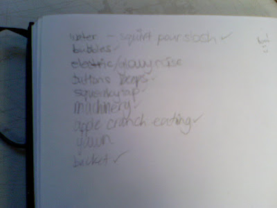
The main things we need sounds for are above. We need machinery noises to make it feel as if this brain is a hive of activity. Beeps, whirrs, dings... anything that suggests the presence of mechanics and industry. Main moom takes a few bites of an apple. We need to ensure that he makes the right noise to make people believe that he is eating. The mini mooms use taps and buckets. Appropriate sounds will be required for those. And there will be a lot of water noises too.
-----
In order to get these sounds, I came to the conclusion that the easiest way to get them would be to use the college's bank of existing sfx. I rented the sfx hard drive and have had a good old search through it. I found almost everything I was looking for. I even found some unusual ambient noises and amusement arcade background noise which will help liven the mood. I couldn't find a yawn though. That shouldnt be too hard for us to film ourselves i think.
I just need to show the group my discoveries, so we can pick and choose which ones will be most appropriate.
Wednesday 24 February 2010
Your Face

He has a nose and ears.
That is all
Actually no it isn't.
PLAYBLAST TIME
That's right, my animation is pretty much finished, I think. I've show a few of my cohorts and team members and they seem to like it, which I'm pleased about.
This is just one of the camera angles. You can probably see a few errors here, because the camera isnt meant to see some of the stuff. But yeh, this gives you an idea of how it looks now. I've done the eyes and blinking and expressions and have adjusted some parts.
I hope you like it too!
Monday 22 February 2010
D8

Hello children! I've got candy for you!
Oh man... creepy first expression!
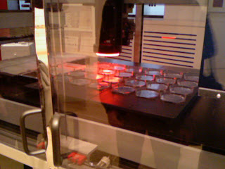
Thought you'd like to see a rendered pic from the animation. The lighting definitely needs some work. The screens behind moom are to overwhelming, and the lighting behind the camera only seems to be able to shine on moom and the buttons. The control panel is barely visible for some reason. Also, I've set moom's body to low quality so I can animate easier.
Oh well, it's quite nice to see him all rendered all the same
Sunday 21 February 2010
Playblasts again
For some reason, the last few vids I've uploaded have started crashing, so I'm going to try uploading these in an attempt to break this losing battle with blogger video uploaders!
I have progressed further in my button bash sequence. I have finished working on the poses in Stepped and Linear, and have now been tweaking everything in spline. I had a lot of trouble with crazy twisting wrists and keyframing things wrong, but I seem to be getting the hang of it now. I am fairly happy with how its going, though I know that it isn't to the highest standard. However, I feel as if I have given it my best and am pleased with the outcome.
I have really tried to exaggerate moom's poses in this, to make this sequence look dynamic. A couple of my mates commented that it ran faster then they had imagined, and I answered that this was deliberately done to set the tone of the clip. Some parts have come out snappier then anticipated, and look a little jerky. I will try and work out these kinks as I go
I still have to do moom's eyes and expressions. Normally showing expression is my favourite part of animating, but I have a feeling this stage is going to be rather laborious. Oh well, we can't have him looking miserable can we? :P
Friday 19 February 2010
Playblast Spam
Here are a series of playblasts of my blocked out animation I have been working on. This is the button bash scene I have mentioned in previous posts. I have been using the moom rig to animate with, and Carlos gave me the modeled control panel for me to use as a guide of how moom should move.
I'm thrilled with how its been going so far! The music you can hear is from the Chessington's Bubbleworks theme music (again shown in a previous post). I have tried to move moom with the tune of the music as acurately as possible.
Problems I've had? Ermm occassionally moom has to pull some rather uncomfortable twists with his body because of the positioning of the buttons on the panel. The lever next to moom's foot is a little bit short, so moom's arm had to stretch in order to move it.
Other then that, it has gone rather smoothly. It has gone better then I had anticipated. I'm not a very accomplished Maya user, but blocking out the keyframes using the "stepped" setting makes it so much simpler.
I'll let you know how it progresses later on
Thursday 18 February 2010
Sound Development
Me and my group have had a think about what kind of music would be suitable for our animation. We wanted it to be fun and jolly, and suggesting a sense of activity and creativity, since it's a brain we are making. There were a few suggestions such as Willy Wonka's Chocolate Factory and Bubbleworks ride music from Chessington World Of Adventures.
Below is the Bubbleworks theme. I think I like this the most, because it has some nice cheery brass instruments that give it more gusto and brashness. I also think that main moom will be able to push the buttons to the the same rhythm of the music.
This is the trailer for Willy Wonka. I like the music that predominantly plays in it.
I also found the below music randomly on my searches, and rather liked it. However, I think it would be more suitable for a more watery bubbly scene. It made me sure of my choice of using the Chessington Bubbleworks theme
Other Animatics
Again, another bunch of animatics. These are being used as reference for the maya animations.
This is a Ren and Stimpy clip that helped me with the overlapping of the bucket. Lovely skip cycle! <3
This is a Ren and Stimpy clip that helped me with the overlapping of the bucket. Lovely skip cycle! <3
Thursday 11 February 2010
Tamagotchi Interface Dump
To create the pixel effect, I painted the backgroung a dull green colour, and then drew grey lines horizontally and vertically to give it that hatched effect. Using the resulting green squares for gudance, I drew on the tamagotchi moom on to it.
 Above is my animation in progress. I've really gotten used to how Toonboom works and am now much more comfortable with using it
Okay here we have 4 animations I have worked on in Toonboom. They feature the little tamagotchi-style version of Main Moom.
I had to animate him in normal happy mode, tired mode, sleeping mode, and exercising mode.
I found it quite hard showing tamagotchi moom using weights. I played around with shape to try and suggest the presence of weights. I think I succeeded
These animations will hopefully be put on to the screens on the control panel in the brain.
Wednesday 10 February 2010
Tamagotchi Research

Here is a sheet of character designs for the tamagotchi creatures that exist. I wanted to try and replicate a similar pixel style that exists in tamagotchis for ur project. I found that Zukyathi, Mametchi and Young Mimitchi came pretty close to how I wanted tamagotchi moom to look
I even looked at tamagotchis to see what the layout is like, so I can use that for my animations


I think the top and bottom ones look a bit too fancy, so I think I might try and go for a simple screen like the second one.
I also noticed that the tamagotchis have icons that help you select actions for the tamagotchis to initiate. I decided to try and use this feature in my work too.
Monday 8 February 2010
Millenium Dome - The Body Exhibit
 When the Millenium Dome was first opened, they had a massive installation that lead people around the various parts of the body. I had the misfortune of not getting a chance to visit it at the time, but I have tried searching for images of this exhibit.
There are very few images on the internet that give a clear example of what it was like inside, so I might have to do some more digging, in order to make this research more helpful.
 However I found this image of the inside of the skull. I think it is a rather interesting perception of how the brain works. As you can see, it has a slight theatrical atmosphere and decor, hence the red velvety curtains stretched across the windows where the eyes and nose are suggested to be. There are several brains watching (and laughing, according to one site's retelling) a brain wearing a fez. The main hat-wearing brain appears to be entertaining the others with jokes.
I'm not sure whether I find this research altogether helpful for us, since this seems to be a more silly and slightly unnerving representation of how the brain works. However, I find it rather interesting. I'm glad I did look into this more.
I find it more impressive that a large representation of the human body was made for people to look around. It must have taken a lot of concept and development to complete successfully. I just wish I had been able to visit it back in 2000 now. :(
Toonboom clips for reference pt 1
Here are some very rough animations I did, trying to play around with the lead mini moom character operating the machinery. I wanted to make it look as if he was performing as he was pressing the buttons, showing that he really enjoys his job. I thought that it would make the clip more interesting if it had more of a rhythm to it
The one below is my first proper go at it. I later decided that a front view of him pressing the buttons didnt give the viewer a very exciting idea of how he is button pressing.
I've been having a think about how I want some of these shots to be animated in 3D. I used Toonboom to create these sequences. I had also just purchased a Wacom tablet, so this exercise has enabled me to improve my cg drawing skills.
I think I definitely prefer the 2nd clip I animated. It flows a lot better, and really plays with exaggeration, for more effectiveness. The angle allows a lot more scope for poses and expression aswell.
For the second clip I looked very closely at some clips on youtube I found. There is an arcade game called "Pop'n'Music" that is hugely popular in Japan. I first saw it being played briefly on the film "Lost In Translation" and I really like the fun rhythmic movements that it displayed. Here are the clips that inspired me the most, research-wise
I really like this one, because this guy is really putting on a show for all the people watching him, and he does it in a pretty cocky and over the top fashion.
This one is nice, because he is a bit more bouncy, and his actions he does with his legs are quite interesting to watch.
The video above is just mind blowing. His fingers move so fast and with such pre meditated thought. It reminds me a bit of a shot from "Cloudy with a Chance of Meatbals" of the scientist Flint operating his machine in his lab.
Each person played the "Pop'n'Music" in a different style. I think this research has helped guide me with how important it is to decide what kind of emotion you want to get across with something as simple as someone operating an interface. Do I want him to be bored or elated that he is doing this job? That's the question I asked myself. I definitely used the reference material to my advantage.
Thursday 4 February 2010
Development of Ideas 3
Here's so,e stuff that was posted on the group blog that I wanted to post up on here
 Here you can see our lovely group board with our collective effort beautifully plastered on to it. We have all done so much already. I feel very confident that we will come up with a fantastic finished product by the end of the project
 Here are two postcards I collected from the museum I visited. They show some lovely patterns and colours inspired by the body. I love these two postcards, and have been highly influenced by the look of them for this project.
 This pic shows my early concepts of the brain layout. I wanted it to look vast and organised. The bottom left diagram is the one I eventually preferred the most. the top right picture is how I envision the brain to look if cut in half and viewed from the side
 This is my first piece of concept art I came up with for this layout for the brain. I was driven to use the two postcards above, and I really wanted to incorporate some of the colours and patterns into my work.
This was done using markers and coloured pencils. I wasn't altogether happy with this picture. I felt that the 'walls' of the brain looked to busy. I also felt that the control panel looked a bit too blocky. I wanted to give it a more organic feel.
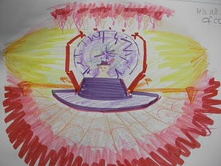 This is a picture of the brain from the fron looking to the back. I like this picture a lot, because it is simple, and uses the colours more effectively. The purples and yellows mix together nicely, causing a nice contrast. I remembered that Osmosis Jones concentrated more on purples and yellows for the brain in the film, and I used this information for my own use.
Development of Ideas 2
Here are some photoshop pictures I've done as a contribution towards the concept work.
Joe Angelo did a fantastic orb simulation using a mixture of Maya and After Effects I think. I have incorporated his orb idea in my work, as you can see.
 We all decided that there should be several mini mooms operating this body, one of which will be the master who will operate the machinery. Above is a picture depicting this idea.
 Here is a shot taken from below the paths, roughly at the same level as the spongey surface. I had the idea that the whole place created a completely spherical shape, and the orb was at its centre. The vein pillar you can see here helps support the orb, and also feeds information to it from the rest of the body.I felt having everything suspended would also give the paths more of a reason for being there, and would create more of a danger for the mini mooms running backwards and forwards along them.
 Here's a picture that shows a shot looking down on the environment. At the end of each path is a funnel, which is where the mini mooms transport fluid. They get the fluid from taps at the centre bowl where the orb sits. There are taps at its base where you collect the fluid.
Sketch Dump
 I had the idea of having cables as a means of sending brain signals around the body.
 Here's some drawings around the idea of how the interface of the control station would work.
I played around with the idea of having a tamogotchi pixel image to represent the whole human body, to be displayed on the control panel screen.


Sorry I forgot to rotate the last image. Oops! These two images play around with the design of the control panel and chair.
I also thought that it would be cool if the brain chamber was surrounded by filing cabinets. They would contain memories and data.
Development of Ideas 1
Our group had many paths to choose from, in terms what kind of envionment we wanted to do. We considered many various possibilities. We had the idea of following up a project an Environment design student from another course needed work on. We also considered the idea of designing a road that had one side of posh rich houses and shops and the other side poor and tattered.
However, Jo Angelo came up with the idea of designing the insides of the human body. In the end, we decided to follow up this idea. As you can see, I did some research into the human body and, in particular, the brain. Here are some mind maps I did focusing more on the brain and the heart.


 I'm quite interested in developing some ideas on how the brain can operate. I think it has the most potential for exploration, so I will do some doodles centred around this idea.
Research: Robbie Wilkinson
http://www.robbiesbrownshoes.com/
Here's an artist my cousin's girlfriend recommended to me recently. His name is Robbie Wilkinson and he does illustrations for Nickelodeon, The Guardian, and several magazines such as Pit Pilot Magazine and Vice Magazine.


 I discovered these really unusual concepts of the human body that he had on his site. I'm not sure what the purpose of these illustrations are, but they really challenge your view of how the body can be represented.
The way Wilkinson has personified the different organs breathes life into them and gives them character. Making the different shapes take on personality helps the viewer relate to their role in the body, and provides some amusement as well. For instance, the brain is dressed like a king and appears to be controlling it using a horse's reins. The Sad looking heart is being constained by a lung on each side, each resembling a frumpy old woman smoking cigarettes. You can tell immediately what kind of lifestyle the owner of these organs lives because of Wilkinson's interpretation. This person clearly doesn't take care of his or her body.
At the same time, the colours and shapes that he uses are a little grotesque to look at, and a bit unnatural. The bones are a nasty shade of greenish yellow, the heart and tongue are a sickly shade of green, and the lungs are an inflamed bright pink and purple. This further emphasizes the message that Robbie Wilkinson is trying to send to his target audience.
I think that these pictures would be good if they were used as a campaign against smoking and promoting good health.
As for it's contriution to our group project, I think it has opened my eyes in terms of design. There are many creative ways of expressing how the body looks and works, and this is another good example.
Sunday 24 January 2010
Research: Osmosis Jones
Osmosis Jones is a film starring a personified white blood cell of the same name. The unsuccessful officer tries to fight bacteria and germs from the body he is protecting, which belongs to a very unkempt man called Frank. With the help of his new accomplice Drix, a pill of extreme fighting power, Jones clamps down on the treacherous antagonist Thrax and brings peace and good health to every cell in Frank's body.

Aside from the amazing cast of actors involved in this film (Bill Murray, Chris Rock and David Hyde Pierce, to name a few), the way in which this film has been put together is pretty well thought out. The contrast between the real outside world of Frank and the animated body in which Osmosis Jones resides is very refreshing. And the animation isn't half bad either. The characters move very smoothly and expressively. The way a character moves reflects its personality. The only problem I have is that the lip-synching can be a bit off occasionally. Other then that, I commend the animators for their efforts in making these characters so fun to watch.
What I want to concentrate my attentions on is the environment. The body is shown in a very unique way. The many parts of the body are turned into cities comparable to places like New York. There are roads are twist and turn, transporting cells around the body, rows of wobbling buildings, cars that morph to the shape of the passengers, and wonderfully interactive machinery that power the many elements that keep Frank ticking. This film reminds me of Shark Tale, only set inside a human being, not in the sea.

I watched carefully when the brain made its first appearance on screen, which was about 10 minutes into the movie. This is where the mayor works and controls Frank's many body movements. I noted that varying shades of purple were used, to heighten the brain's importance. There's even some yellow, which makes sense, because yellow and purple are complimentary colours.
There's a part of the brain which is like a call center, which presumably receives all the phone calls from the other areas of the body, like the stomach or the lungs. There is electricity, which must symbolize the lightning messages that the brain receives and sends out. The main room of the brain looks out across the whole kingdom of Frank, as if it were a skyscraper of some kind. There are screens that indicate when something is occuring that the mayor should know of. The shapes the archs and tunnels form are nice and rounded and circular, which softens the mood and gives the place a modern feel. A very stylish place that shows power and intelligent thinking.
There is a lot I can get from this film that can utilise me for the future of our project. I'm thinking that the use of colour and shape is fundamental in our success. I will continue to look at other sources of inspiration, whilst thinking about designs for our brain.
Friday 22 January 2010
Photos of museum displays
Wow I really hit the jackpot today! There was so much stuff at this museum that inspired me, in terms of the body. Here are some photos I took. Sorry if the quality is a bit poor - I used my old knackered phone to take these.

This is a painting of the inside of the human body. Although it looks kinds gross here, I kinda like the idea of the


This is a painting of the inside of the human body. Although it looks kinds gross here, I kinda like the idea of the


Tuesday 19 January 2010
Digital Environments/Visual Studies Project
As written in the project brief document on Moodle:
For this project you will be working in teams of four or five students. You will all be working towards a final collaborative short film but will have the opportunity to fulfil clear and separate roles within the team.
• You will be working to create an animated environment.
• You will be collaborating not only with the other animators in your team, but also with designers from the environment design course.
• Their designs will form the starting point for your work.
This environment will be modelled in 3D, UV mapped, textured and lit based upon the research of materials and environments as initially designed or propsed by IDEAS students. This research will consist of practical site visits (such as the trip to Barcelona and alternative London based venues) and associated drawing and photography, as well as academic research via the web and the LRC.
This environment must demonstrate integral animation, it could be mechanical such as machinery, doors, windows, windmills etc, or it could be more organic, and atmospheric, such as the effects of wind on plants, weather conditions etc. It could be a much more long term animation to show the effect of years passing, rather than minutes. For those of you who feel that you are more character animators than computer visualisers you can focus upon contextualising the designed environment by populating it with characters using that environment, it may be that the environment is being used in an unintended or unexpected way that has evolved through public interaction with the space. (Was the South Bank designed for skateboarding or parkour?).
It may be easier for you to think about defining the way in which you will approach this project by choosing one of the themes listed below.
a) Changes over time (historic).
b) Changes in weather or lighting (climatic).
c) Changes in use of the environment (contextual).
Although you will be working as part of a team towards your final animation, you will also be required to provide evidence of your individual contribution to the project via a blogged design journal where you will document your personal research, experimentation, and acquiring of new skills.
I've joined a group of very talented students to take on this task. Mel, Carlos, Rory and Joe are my team mates for this project. I'm really excited and happy to be with such a cool team, and cannot wait to get started on this!
Friday 15 January 2010
Our adaptation of the project
Our group has decided to concentrate on inside the body. We've done some mindmapping on the theme, and we seem to have come to the conclusion that we are going to centre our ideas on the brain.
We're going to allocate tasks for each other and do lots of research, and then share some ideas on how we are going to define a nice style for our piece of work.
Possible Research sources:
We're going to allocate tasks for each other and do lots of research, and then share some ideas on how we are going to define a nice style for our piece of work.
Possible Research sources:
- Monty Python - Terry Gilliam
- Osmosis Jones
- Millenium Dome
- The Magic Schoolbus
- Biology
- Sci-fi? (If we are going for a futuristic feel)
- The Fantastic Voyage
- Wellcome Collection - Museum college trip
Subscribe to:
Posts (Atom)
