 Here you can see our lovely group board with our collective effort beautifully plastered on to it. We have all done so much already. I feel very confident that we will come up with a fantastic finished product by the end of the project
 Here are two postcards I collected from the museum I visited. They show some lovely patterns and colours inspired by the body. I love these two postcards, and have been highly influenced by the look of them for this project.
 This pic shows my early concepts of the brain layout. I wanted it to look vast and organised. The bottom left diagram is the one I eventually preferred the most. the top right picture is how I envision the brain to look if cut in half and viewed from the side
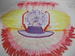
 This is my first piece of concept art I came up with for this layout for the brain. I was driven to use the two postcards above, and I really wanted to incorporate some of the colours and patterns into my work.
This was done using markers and coloured pencils. I wasn't altogether happy with this picture. I felt that the 'walls' of the brain looked to busy. I also felt that the control panel looked a bit too blocky. I wanted to give it a more organic feel.
 This is a picture of the brain from the fron looking to the back. I like this picture a lot, because it is simple, and uses the colours more effectively. The purples and yellows mix together nicely, causing a nice contrast. I remembered that Osmosis Jones concentrated more on purples and yellows for the brain in the film, and I used this information for my own use.

No comments:
Post a Comment